Collection of work for Broad City branding and 360 marketing campaigns.
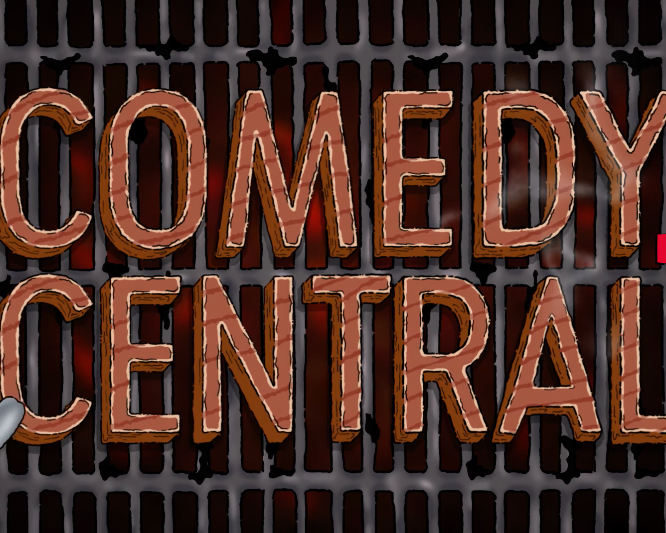
Below are a range of logo designs we explored for season 1.
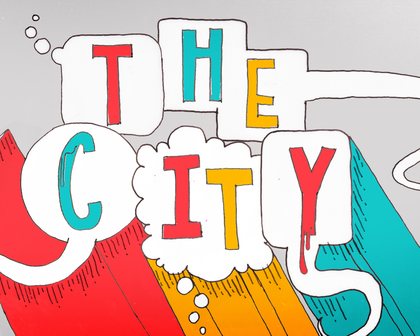
Early concept to highlight NYC as one of the characters of the show.
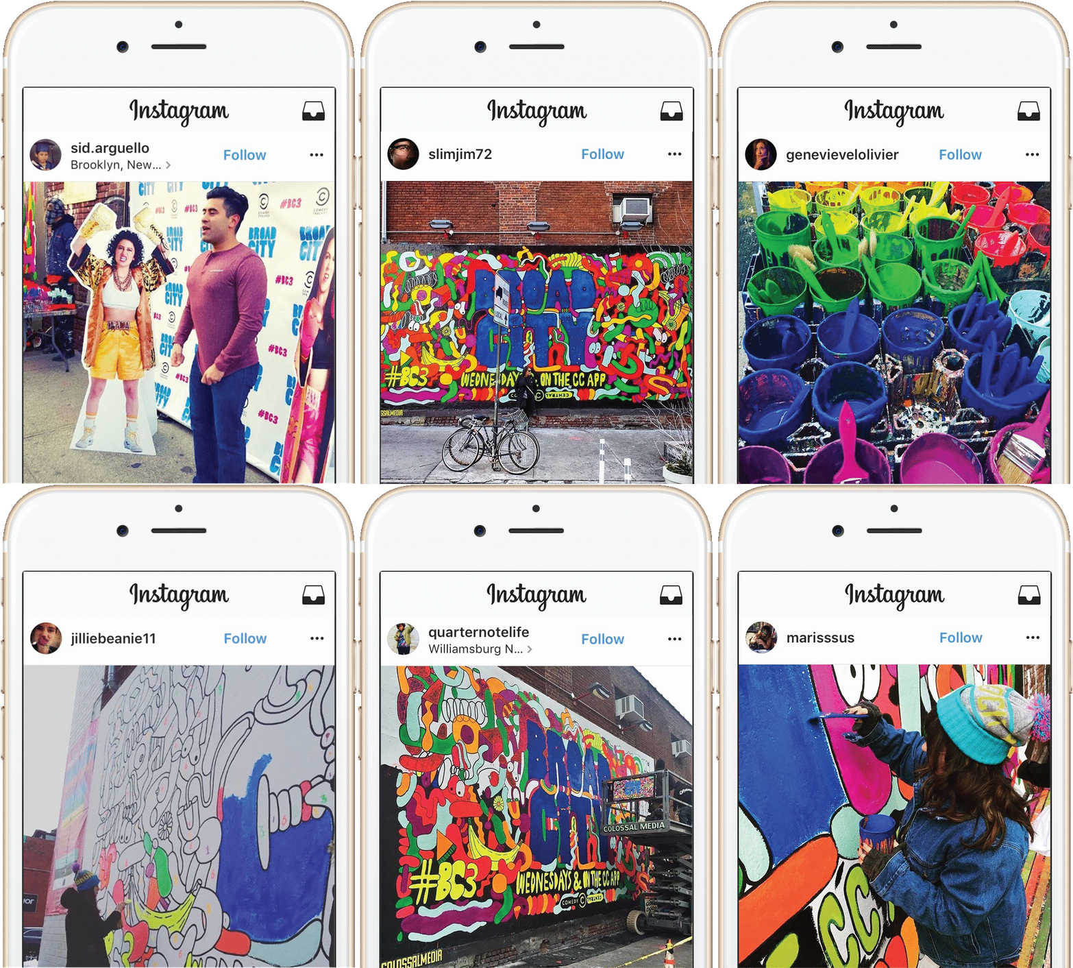
Created a paint by numbers stunt to advertise the new season.

Beginning and final concepts for critic spots from left to right.
Final designs out in the world.
Final designs for critic spots animated.
Storyboarded potential illustration concept for the bus hit spots.
Final execution for bus hit spots.
Show open pitches.
Rough video executions for show open pitch.
Broad City promos for Season 2. In addition to graphics we added in leafs on the trees and a subway car.
For season 2 critic spots we worked with the comedian and dentist on the show, Hannibal Buress. He read some quotes from fans. Below are the designs and animations for them.
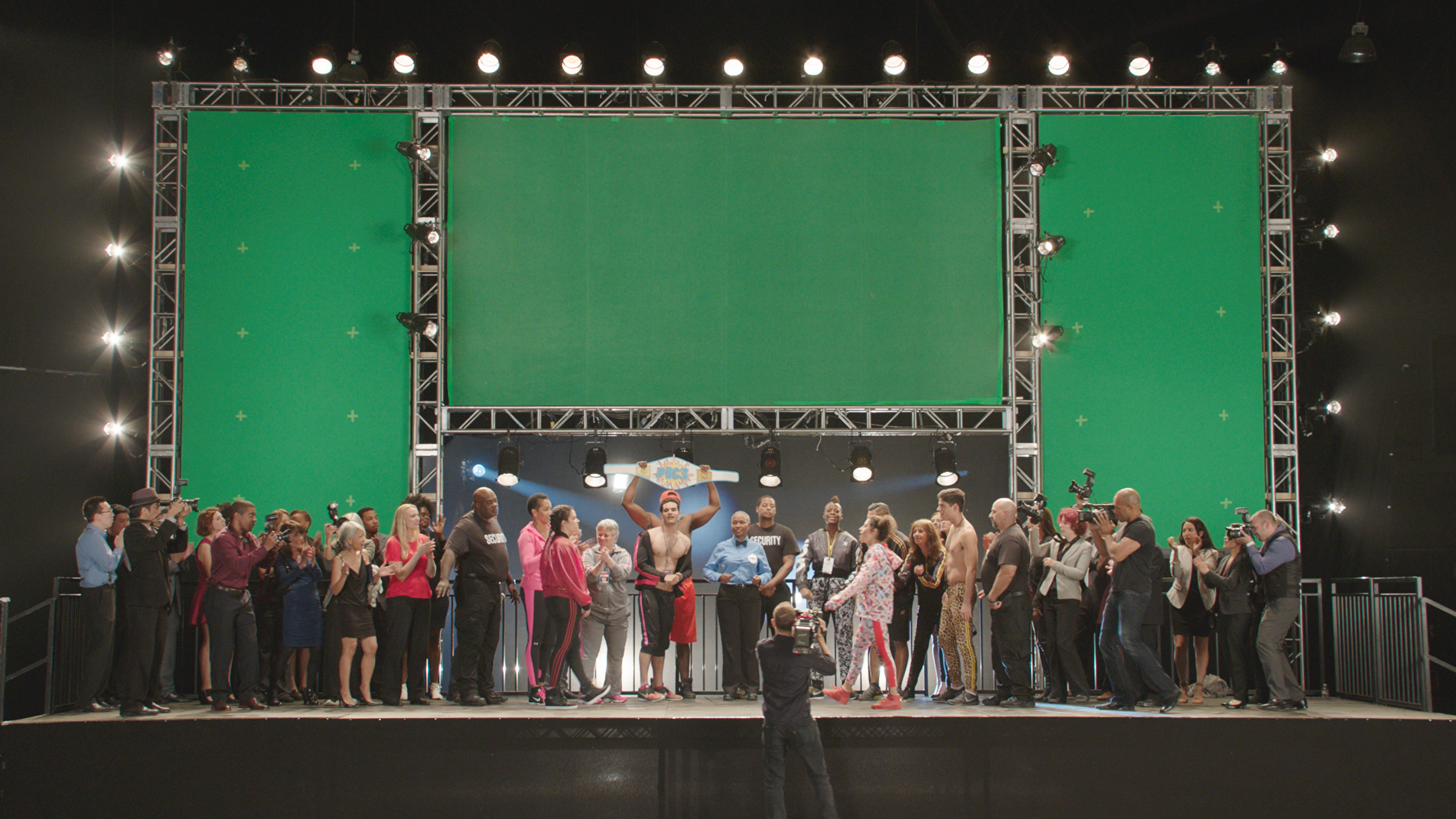
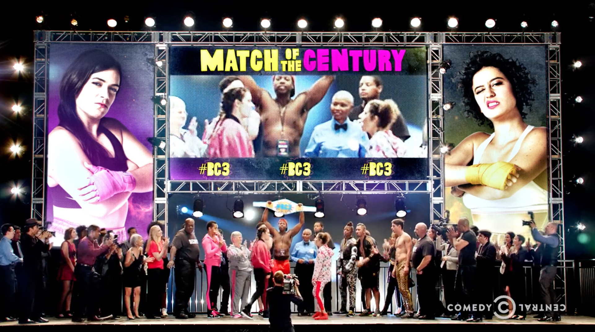
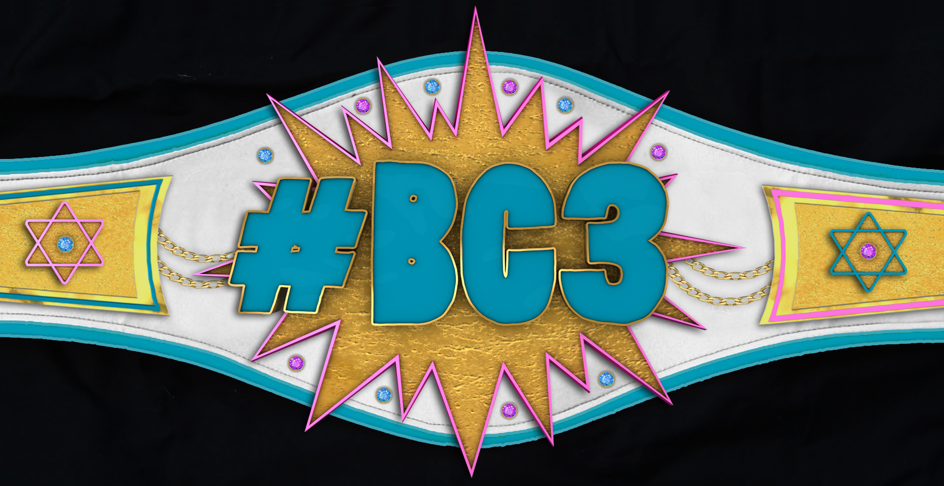
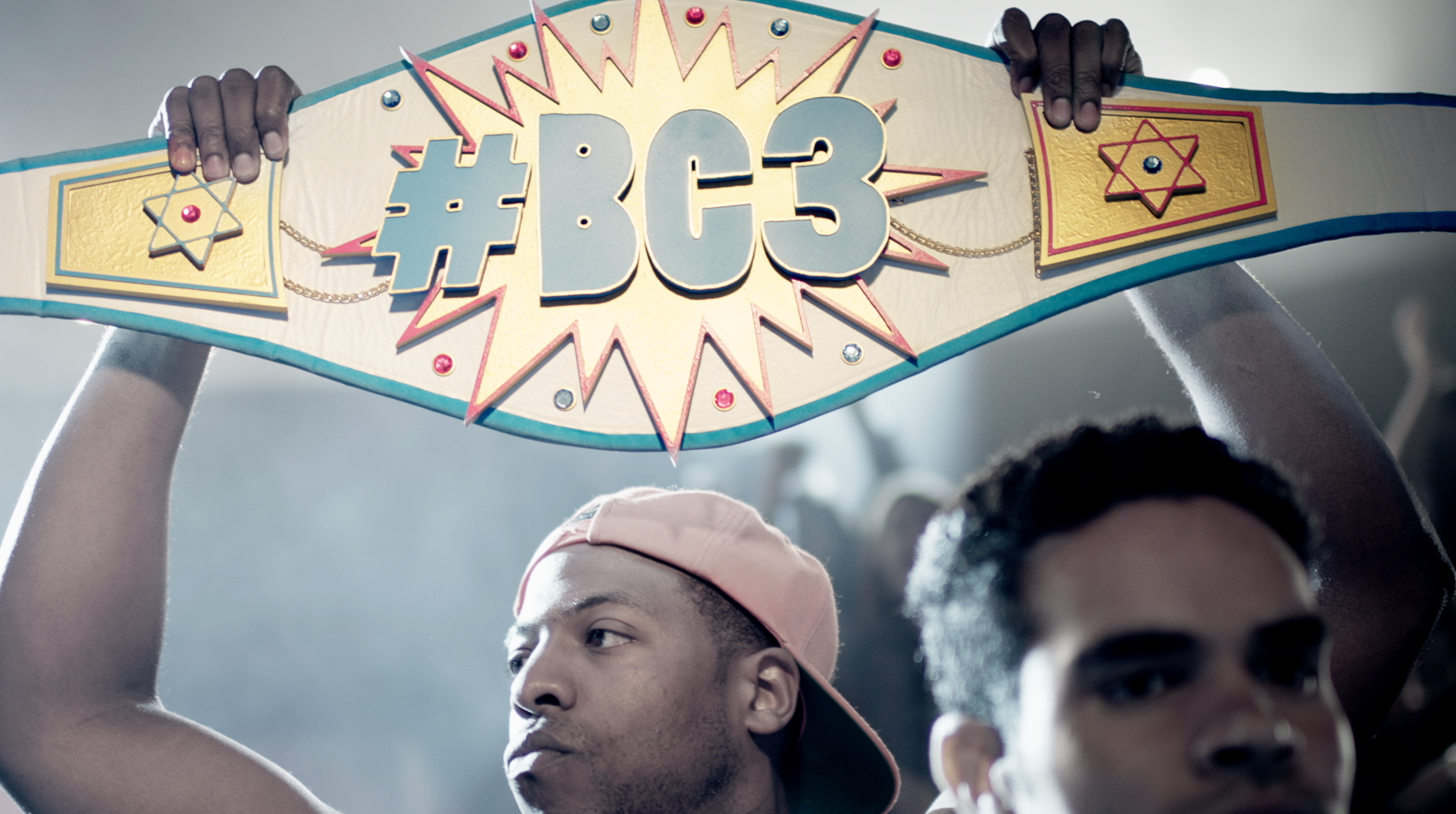
Broad City promos for season 3 we created a boxing theme.
Boxing belt designs before and after. First created in cinema and photoshop before being created by props for the shoot.



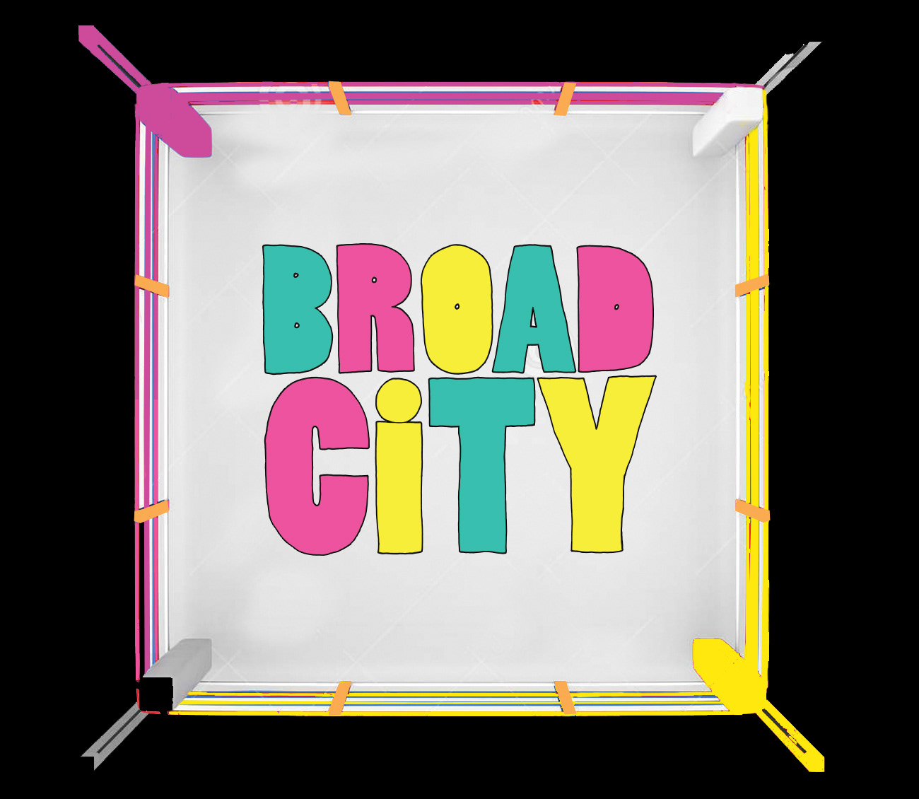
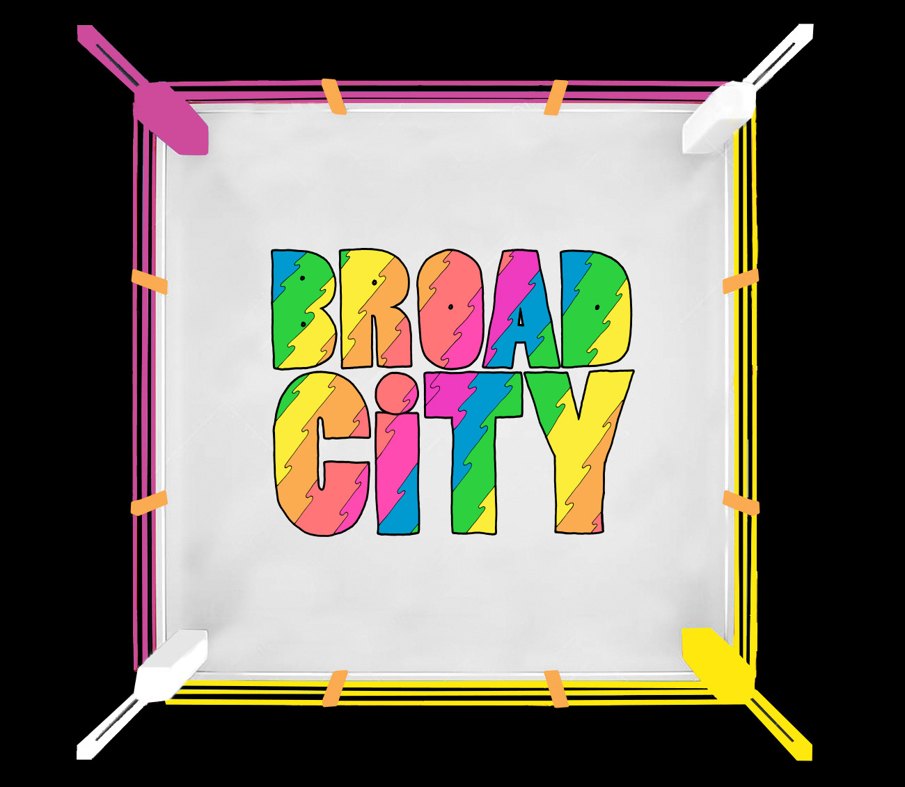
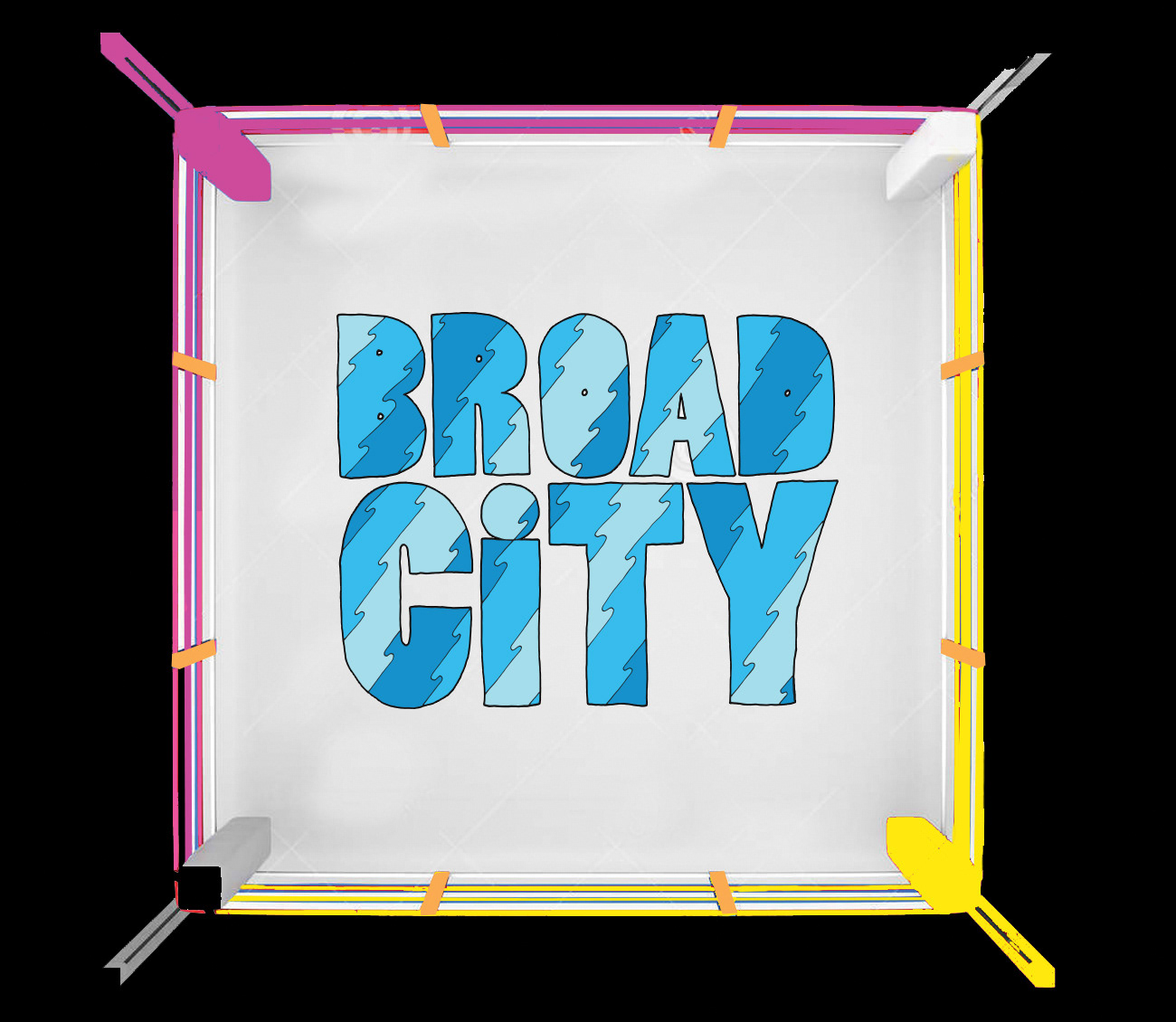
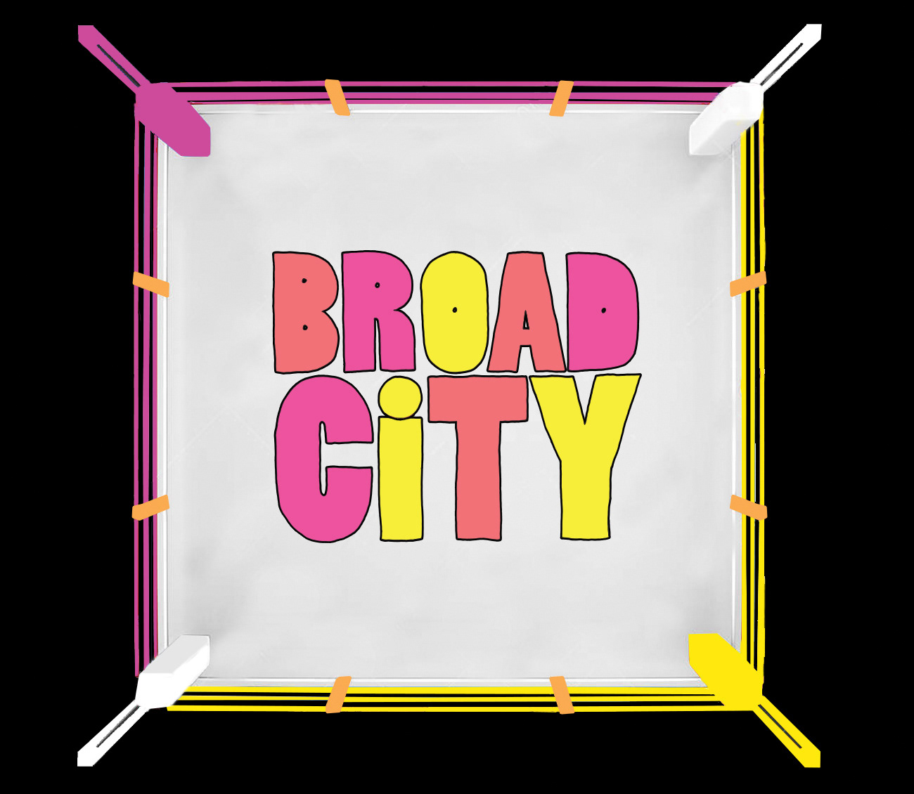
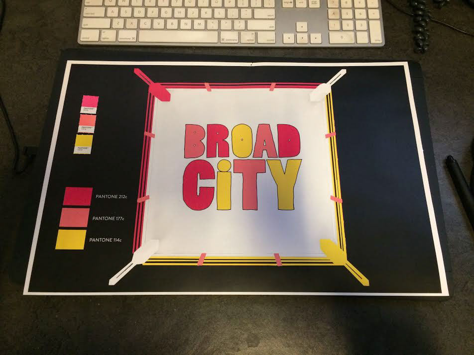
Boxing ring design. We tried multiple color combos before landing on one (literally).
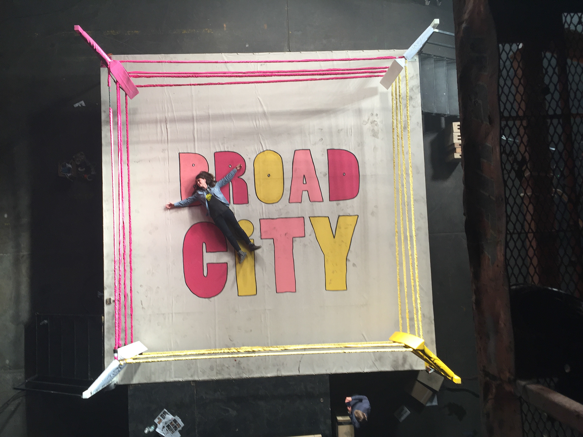
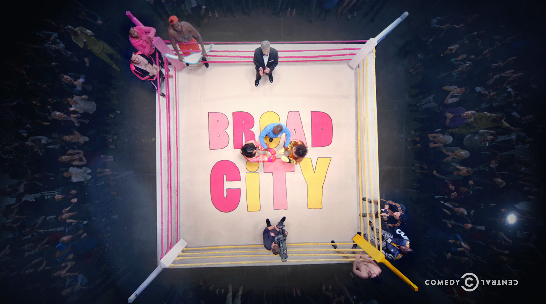
Before and after compositing.
